
ReVise: Smarter Ratings & Reviews

NYKAA FASHION | 2024
From the first design audit of R&R to find the gaps, understand the market and users, and generate insights for the next phase of action.
Subsequently, investigated several concepts to determine a more practical and understandable approach to increase user involvement with review form submission.
Over 4 months, I led the end-to-end project, collaborating with cross-functional teams. I conducted user research with a researcher, and independently handled competitive analysis and secondary research.
The impact we created
A straightforward, user-friendly review form that promotes user involvement and raises the percentage of completed reviews to facilitate the gathering of high-quality user reviews. Consequently, this enhances the user's purchasing decision-making process and increases business conversions.
40% Increase in form completion
Install the Figma plugin and you’re ready to convert your designs to a responsive site.
40% Increase in form completion
Install the Figma plugin and you’re ready to convert your designs to a responsive site.
40% Increase in form completion
Install the Figma plugin and you’re ready to convert your designs to a responsive site.
40% Increase in form completion
Install the Figma plugin and you’re ready to convert your designs to a responsive site.
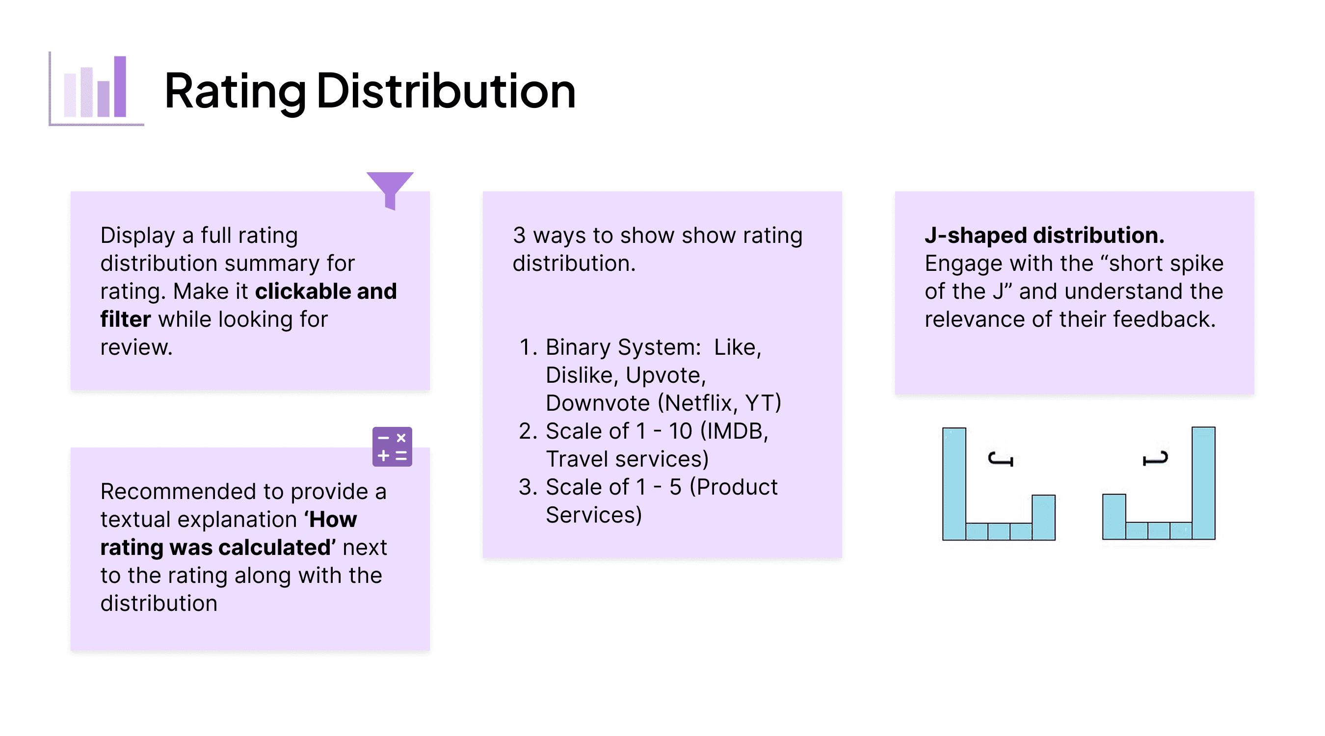
The disconnect between ratings and reality
The current review system has a low submission rate, as users often abandon the process before completing their reviews. The unstructured format—spread across text, Q&As, and tags—creates friction, making it harder for users to provide meaningful feedback. As a result, the business struggles to gather comprehensive, high-quality insights, reducing the effectiveness of reviews in influencing user decisions and driving growth.
The Honest Stats Before Honest Reviews
A snapshot of how reviews flowed through the system—where users dropped off, what they contributed, and why it mattered.
With a 63% review drop-off rate and only 1% containing images, the majority of products lack rich, actionable feedback from users.


Tactical touchpoints like homepage prompts and order reminders boosted daily rating submissions from 488 to 3,294—with the homepage nudge driving the highest engagement
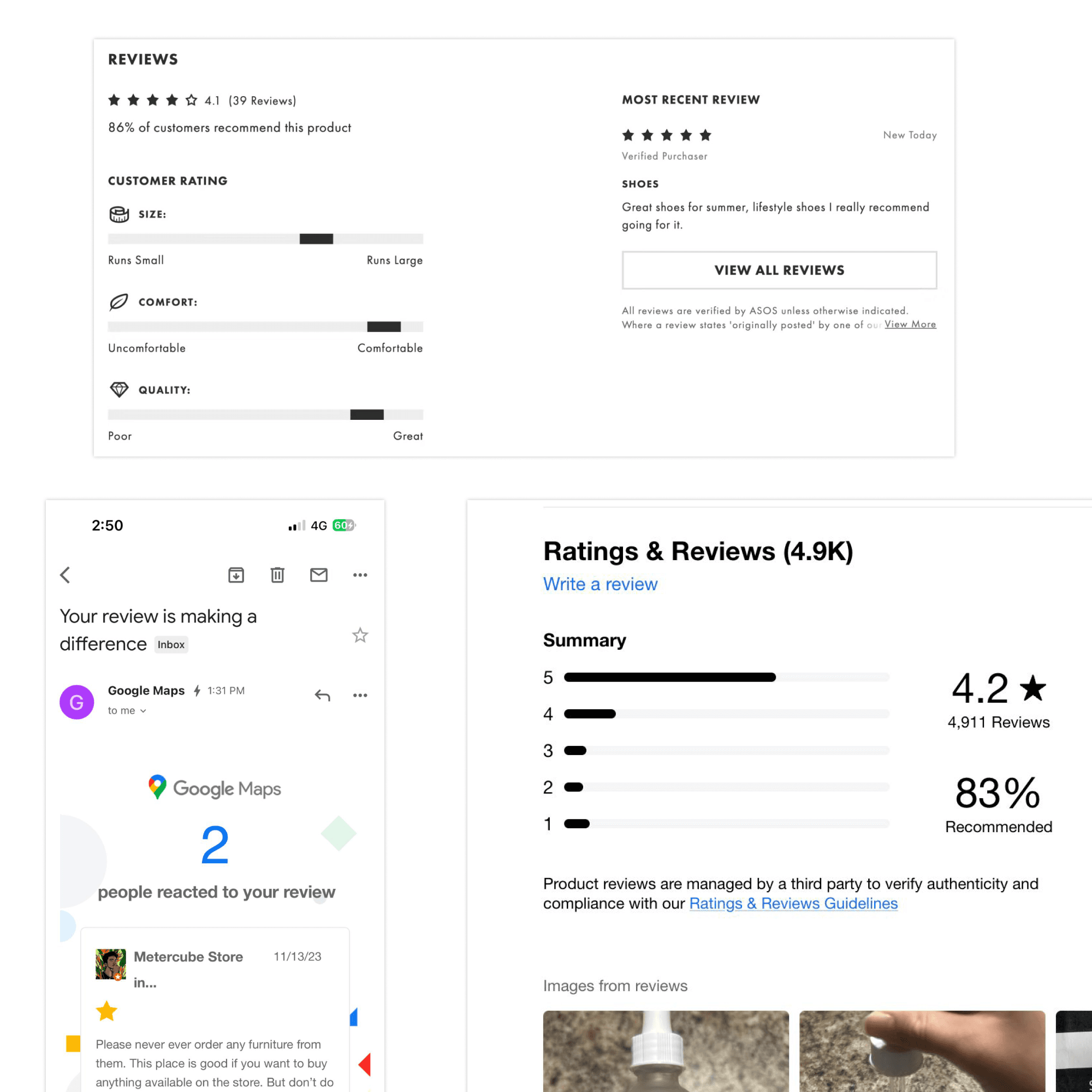
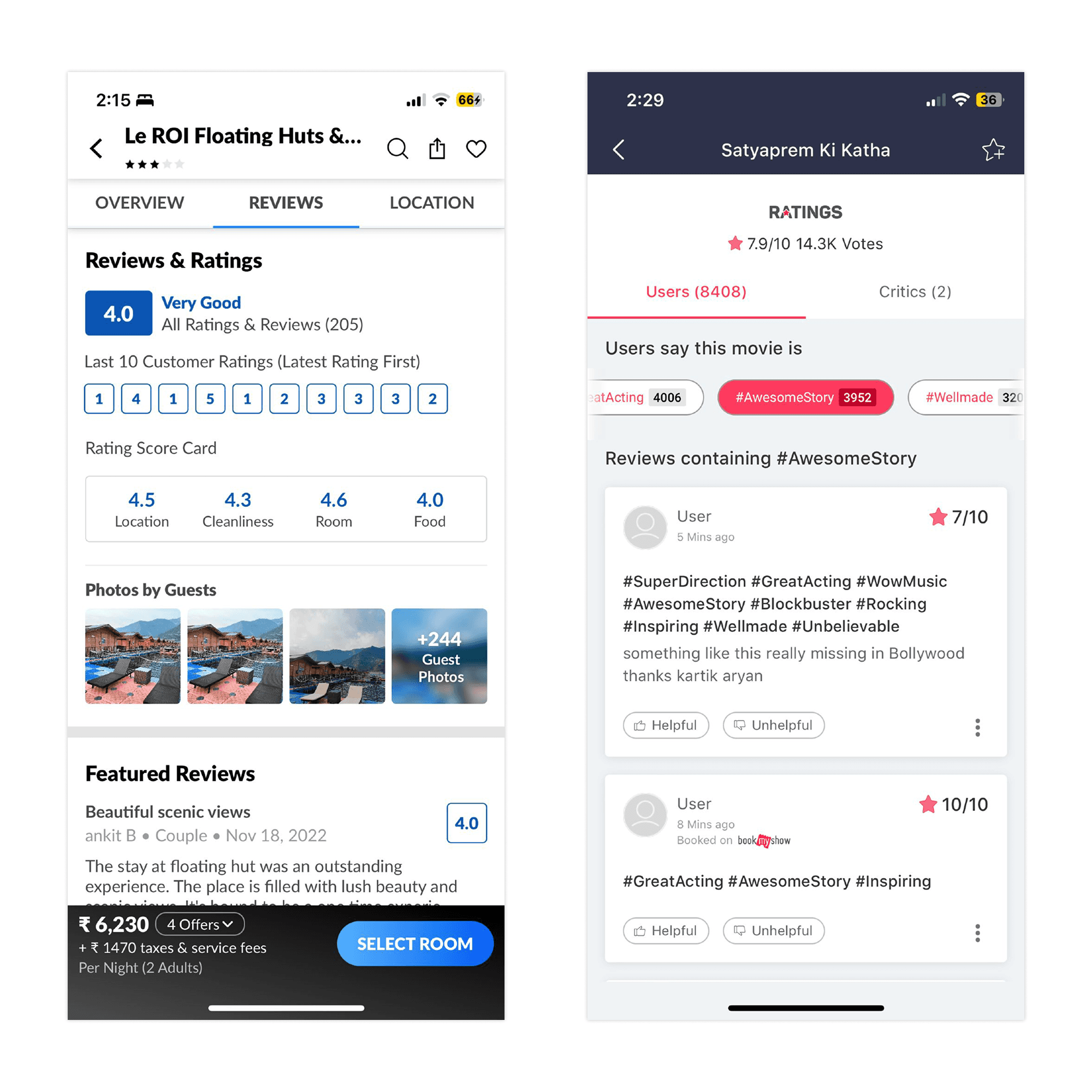
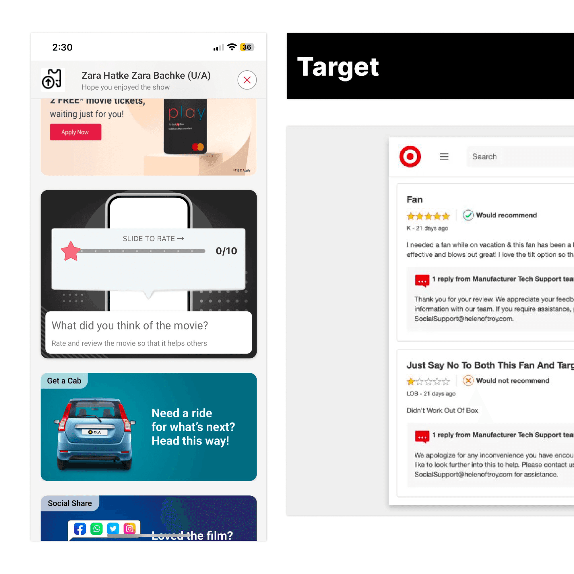
Understanding the Landscape
Before jumping into solutions, I began by understanding the landscape of Ratings & Reviews—how they work, why they matter, and how different platforms approach them, both in and beyond e-commerce.
What I wanted to achieve
Quickly build a solid understanding of the Ratings & Reviews domain.
Learn from best practices and patterns across the industry.
Identify trends and product decisions that improve the review experience.
Gather insights to inform my primary research.
Use those insights to craft How Might We (HMW) questions and guide ideation.
Most importantly, define a clearer and more relevant problem statement for Nykaa.
What I explored
I looked at a wide range of platforms—from e-commerce giants to niche apps and service platforms. I wanted to see:
How they ask for reviews
What kind of input they expect (text, tags, images, etc.)
When and how they prompt users
Whether they incentivize or motivate review writing
How they use that content beyond the product page
Every platform had its own flavor. Some kept it short and quick, others encouraged detail. A few rewarded users for helpful contributions, while others missed the chance to engage users meaningfully.
What I took away
This study helped me uncover not just how reviews are collected—but why certain systems work better than others. It also revealed gaps and opportunities that I could explore further through primary research.
It gave me a direction to ask better questions, focus on real problems, and frame solutions that could actually make reviewing more meaningful—for both users and the business.
Emerging Themes


Exploring Review Patterns Across Platforms
To understand what makes review systems effective, I examined how leading platforms structure and surface user feedback. This helped identify recurring patterns, unique features, and opportunities that could inform stronger design decisions moving forward.


Themes from Competitor Analysis

The Many Faces of a Reviewer
Users interact with reviews in different ways—some are vocal, others stay silent, and a few only speak when something extreme happens. Mapping these cohorts helped shape solutions that meet a range of behaviors and motivations.


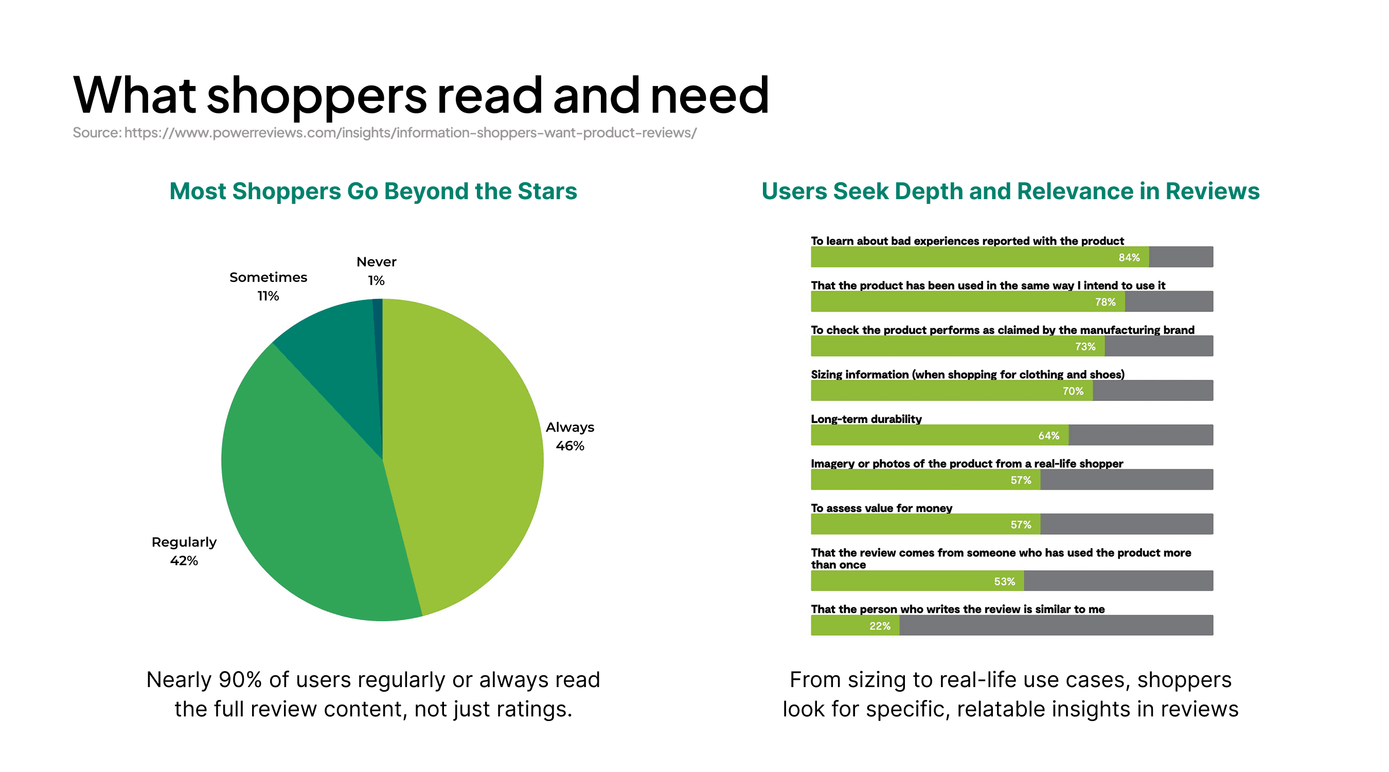
What Real Shoppers Told Us
We spoke directly with fashion shoppers from Nykaa to understand how they interact with ratings and reviews—both as readers and contributors.
Their thoughts revealed what builds trust, why people choose to speak up, and what might actually get more users involved.
See the Full Story

New Problem Statement
Through primary research (in the section above) and behavioural data, it became clear that the current review experience falls short on both collection and presentation. Users struggle to complete reviews, and often don’t find the information they need while reading them.
This led to two focused problem areas:
Review Collection
With only 37% of users completing reviews, the current system feels tedious and lacks motivation—there’s a need to make it more intuitive and rewarding, while enabling users to share richer, product-specific insights through flexible formats like photos, videos, or voice, without feeling overwhelmed.

Review Showcase
While reviews are key to building trust and aiding purchase decisions, the current experience makes it hard to find relevant insights. There's a need to highlight standout feedback, enable smarter filtering and sorting, show clear rating breakdowns, and add social proof to help users make confident, informed choices.
Ideation Sprint: Crazy 8s to Spark Quick Ideas
I led a 90-minute Crazy 8s session with 8 designers to rapidly explore bold ideas—8 concepts in 8 minutes for each prompt.
The prompts were crafted from research insights, and we intentionally ignored constraints to encourage blue-sky, out-of-the-box thinking. This helped unlock fresh perspectives and creative directions early in the process.
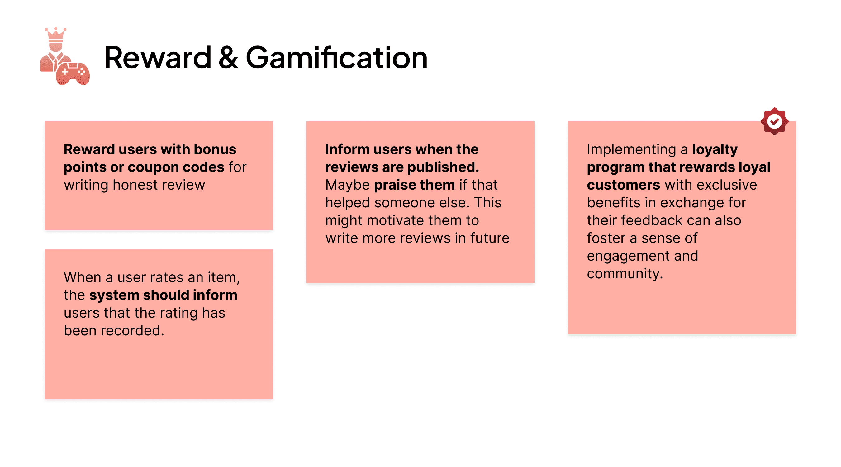
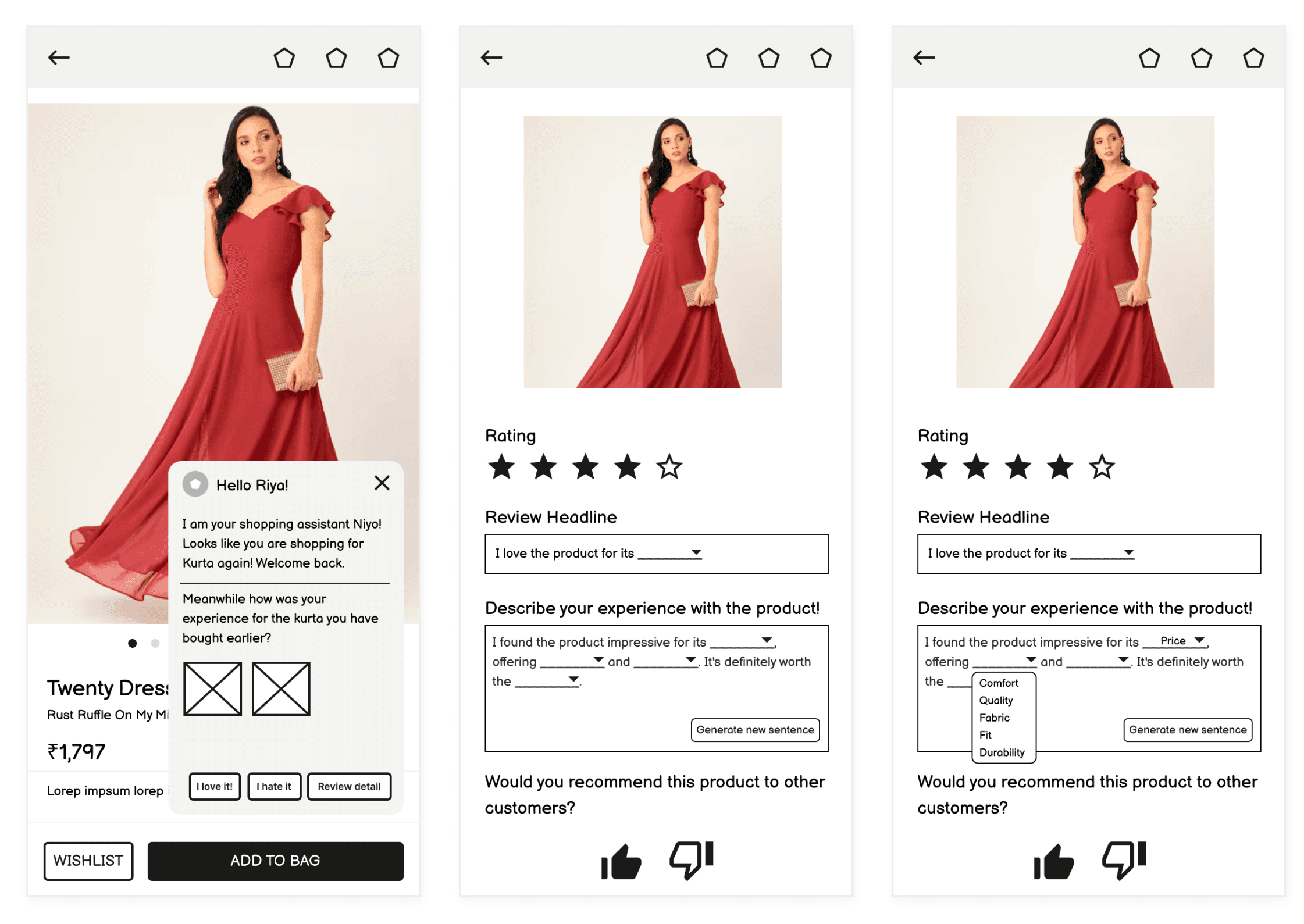
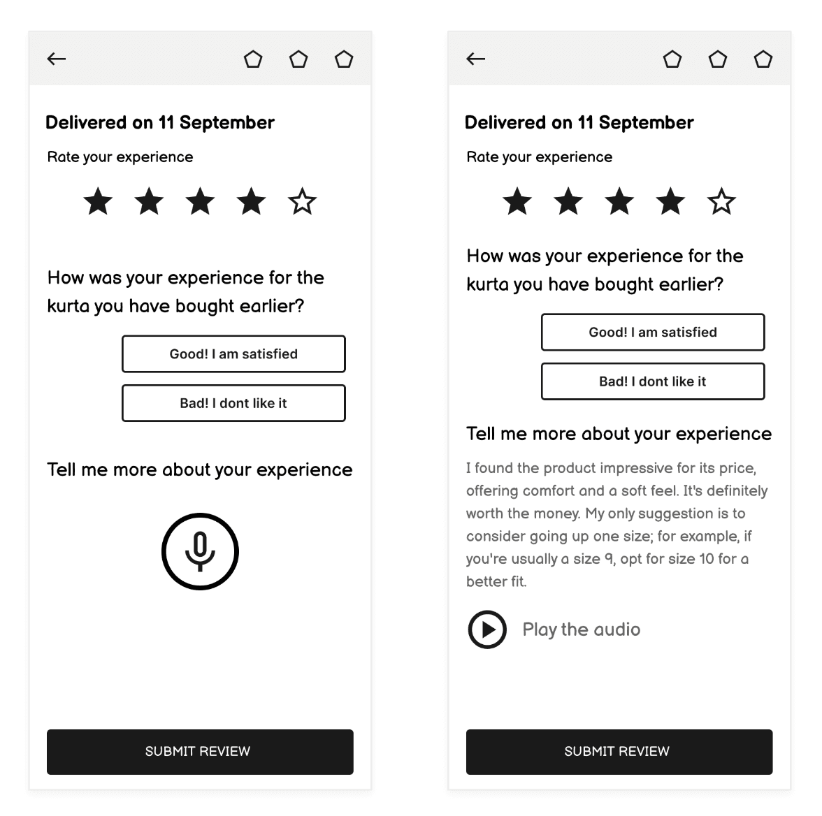
Review Collection Concepts
Feedback form
Voice assistance and translation
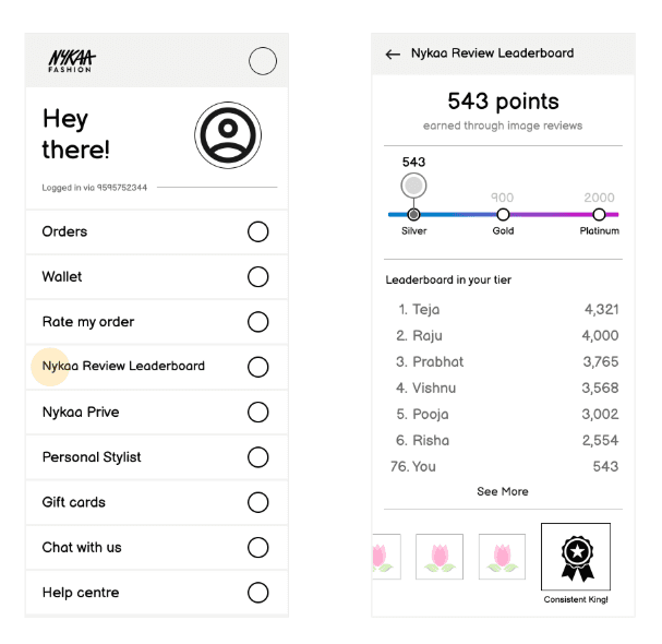
Rewards for reviews
Gamification
Leaderboard & badges
Unique review incentives
User feedback prompts
Inform users of their feedbacks

Review Collection Concepts


Review Display Concepts
AI generated summaries
Highlighting important information
Dynamic Filters
Social interaction with reviews
Customizing reviews
Curated section of reviews
Social proofing
Visual representation of reviews
Images, Videos and Voice
Features that help users’ choose better
Review Display Concepts


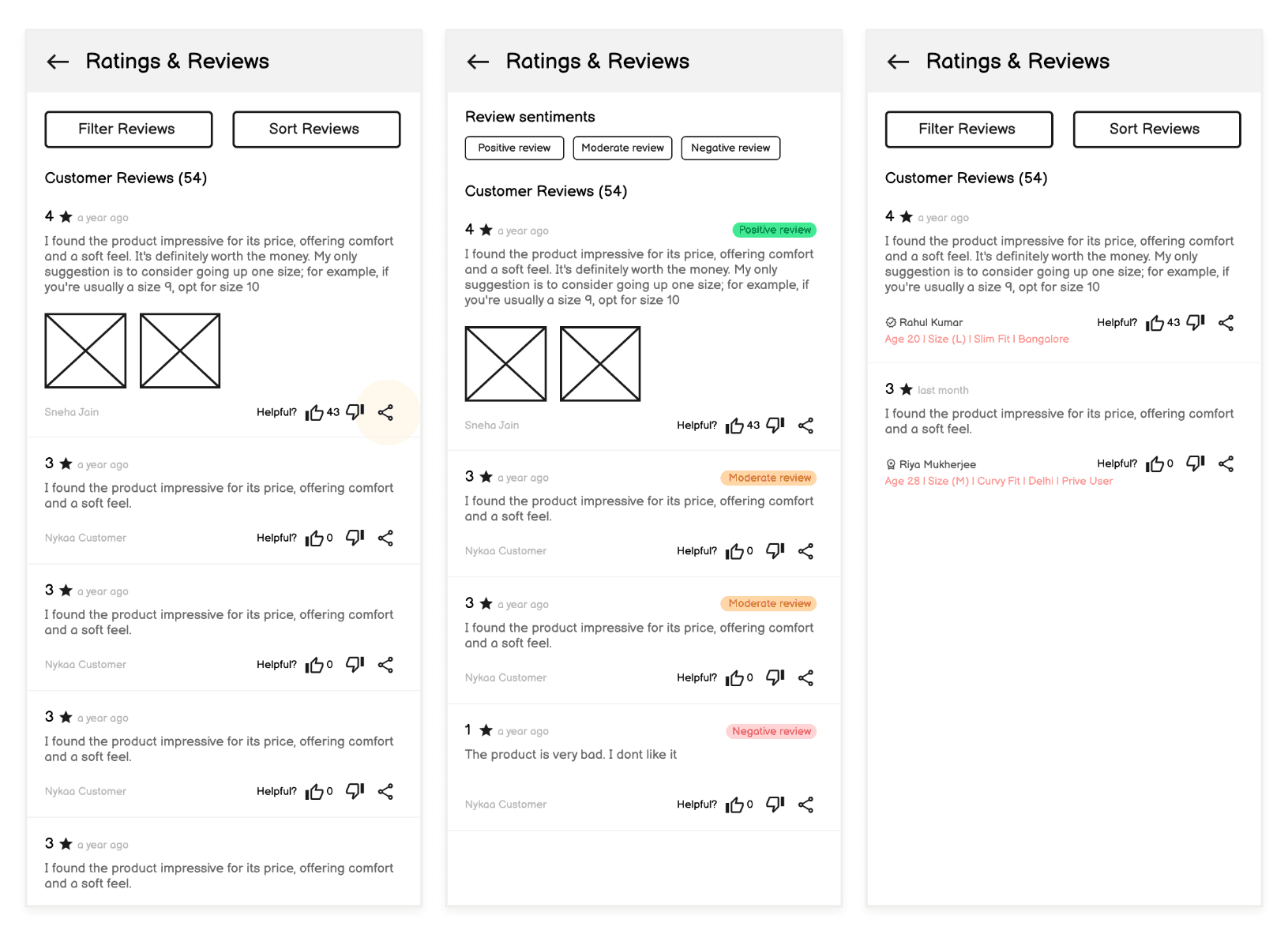
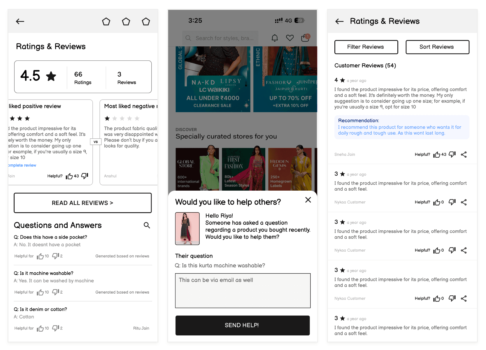


Review display has been scheduled for Phase 2 of the project. The remainder of this case study focuses solely on the review collection journey.
Shaping the Initial Directions
Building on the early wireframes, I began translating ideas into functional interfaces and interactions—this time with real-world constraints and dev feasibility in mind.
These initial directions balanced user needs with system limitations, helping move from exploration to production-ready thinking.
Bringing It All Together
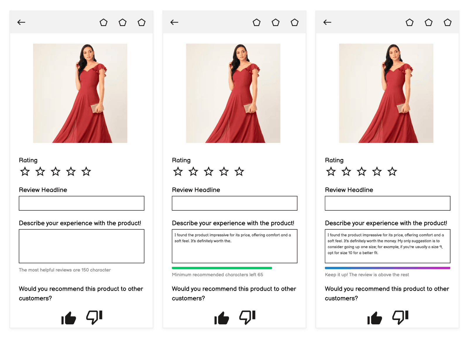
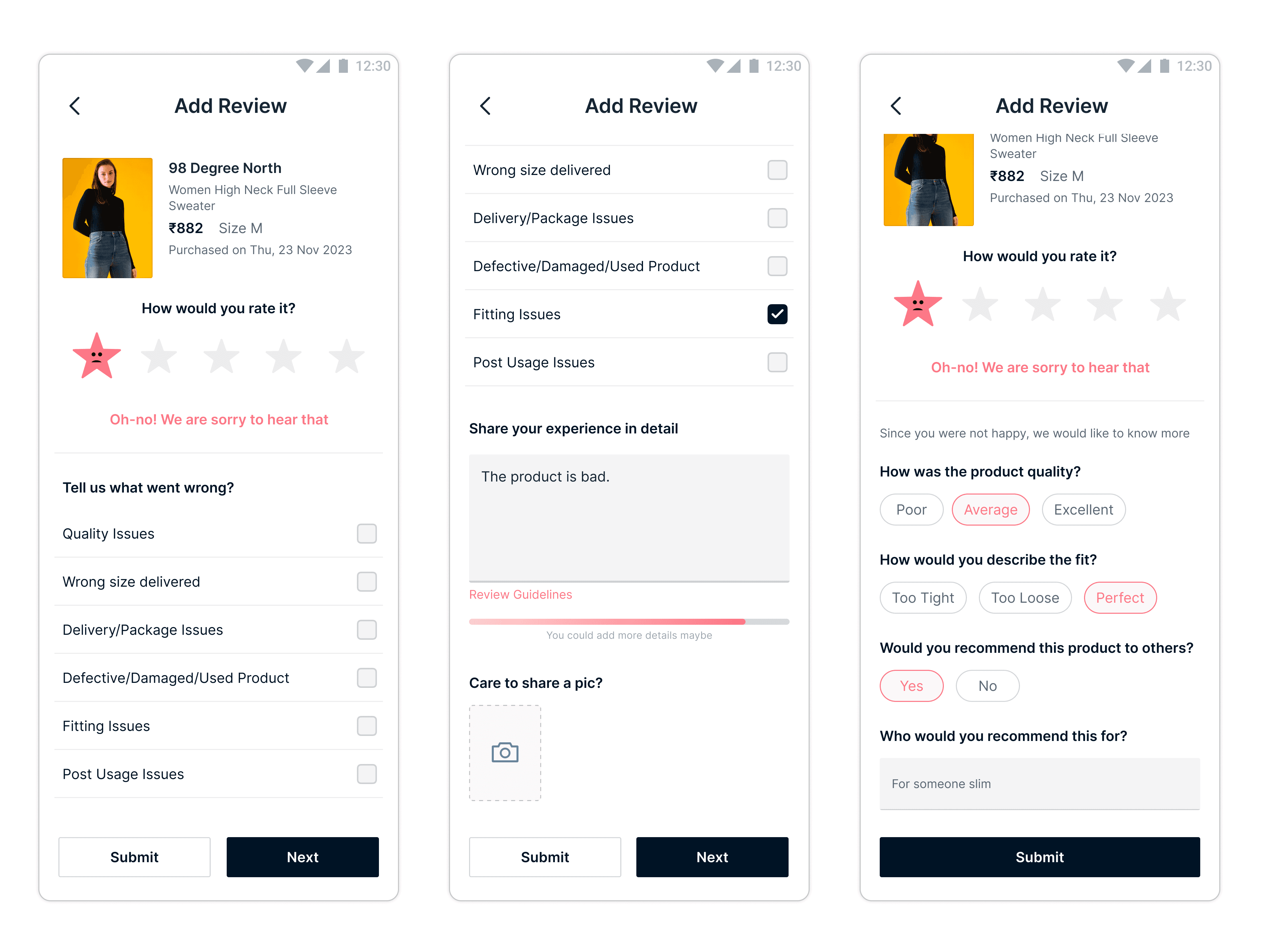
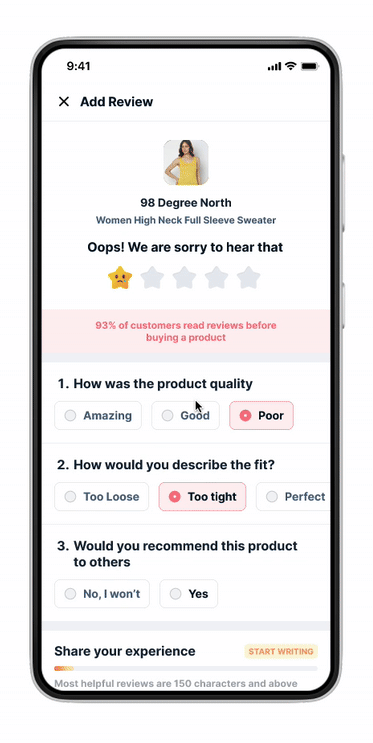
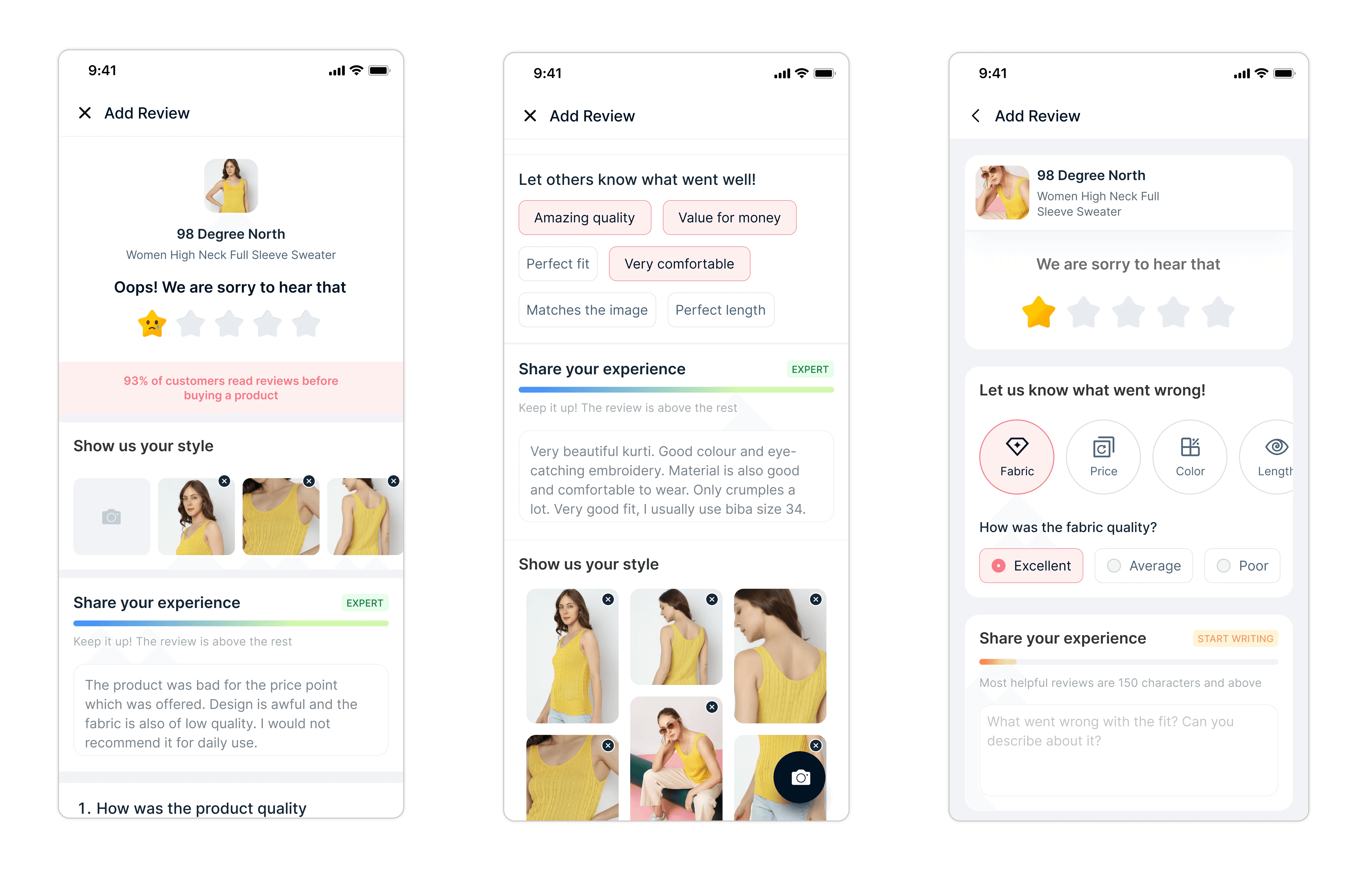
Refined from earlier feedback, this version focused on clarity and usability—featuring a review meter, conditional attribute inputs based on rating, and a clean, relatable media upload section. It struck the right balance between structure, engagement, and feasibility.
Developed two final variations based on feedback from earlier iterations—refining the review meter, introducing conditional rating and attribute sections, and designing a more relatable image upload experience.
Visual Attributes
Attribute Pills
Putting Designs to the Test
After narrowing down to two refined design variations, we conducted unmoderated usability testing to evaluate which version felt more intuitive, motivating, and user-friendly. Each prototype explored different ways of presenting product attributes, rating flows, and image uploads—based on hypotheses grounded in earlier research.
Our goal was to validate whether these iterations truly reduced friction and improved review completion. The test involved 10 users from Nykaa’s core shopper segments, each interacting with both prototypes and sharing detailed feedback. This helped us identify the version with stronger user alignment and higher potential for review completion uplift.
🎨 Visual Attributes Version
Most users didn't find the layout intuitive and felt it added cognitive load
Icons and visuals didn’t align well with the text; users still relied on reading over recognizing visuals
Image layout felt overwhelming, took up too much space, and was easily skipped
Users felt the flow was too long, and the image upload lacked context or proper CTA (e.g., missing camera icon)
Overall, this version felt greyed out and non-actionable, with only one user interacting with the fun fact
Visually Heavy, Low Engagement
💊 Attributes Pills Version
Users found this version straightforward and easy to navigate
Pill-based tags were preferred over images—they felt more descriptive and scalable
Some confusion around the review meter being mistaken for a character limit
A user noted that post-review, they start browsing for other products—hinting at an opportunity to plug contextual engagement here
Users expressed interest in being rewarded for their review contributions
Cleaner, More Intuitive
Fixing What Didn’t Click
User feedback pointed us to two friction points—the review meter and the image upload. So, we zoomed in. Through quick floor tests and fast iterations, we reshaped these moments to feel more intuitive, interactive, and user-first.
Ship sites with style.
Get Started
Learn More