
Revise: Smarter ratings & reviews
NYKAA FASHION | 2023-24

Online reviews are powerful, but underdelivered
On Nykaa Fashion, less than 4 out of 10 users completed their reviews. We weren't just losing feedback but we were losing trust, context, and content that helped others buy better.
So we redesigned the flow from static to smart adapting questions based on sentiment, content and tone.
The result? 28% more submissions, richer feedback and a review system that finally worked for users
Project Overview
About the company
Nykaa Fashion is the fashion vertical of Nykaa, one of India’s leading beauty and lifestyle platform famously known for pioneers in selling beauty products online. It offers curated collections across apparel, accessories, and lifestyle majorly focusing on women centric fashion.

The brief that started it all
Project brief
This project focused on redesigning the Ratings & Reviews experience on Nykaa’s platform—beginning with how users submit reviews. The aim was to increase review participation, collect richer feedback, and create a more rewarding, user-centered flow.
Scope
Phase 1: Review Collection (User-submitted content)
Phase 2: Review Display in Product Page (Planned for future phase)
Approach
We followed a full-spectrum design process—starting with secondary and primary research, followed by structured ideation, rapid prototyping, and usability testing. Each phase helped validate and refine our direction before we finalized the experience for handoff.
The exisiting review flow
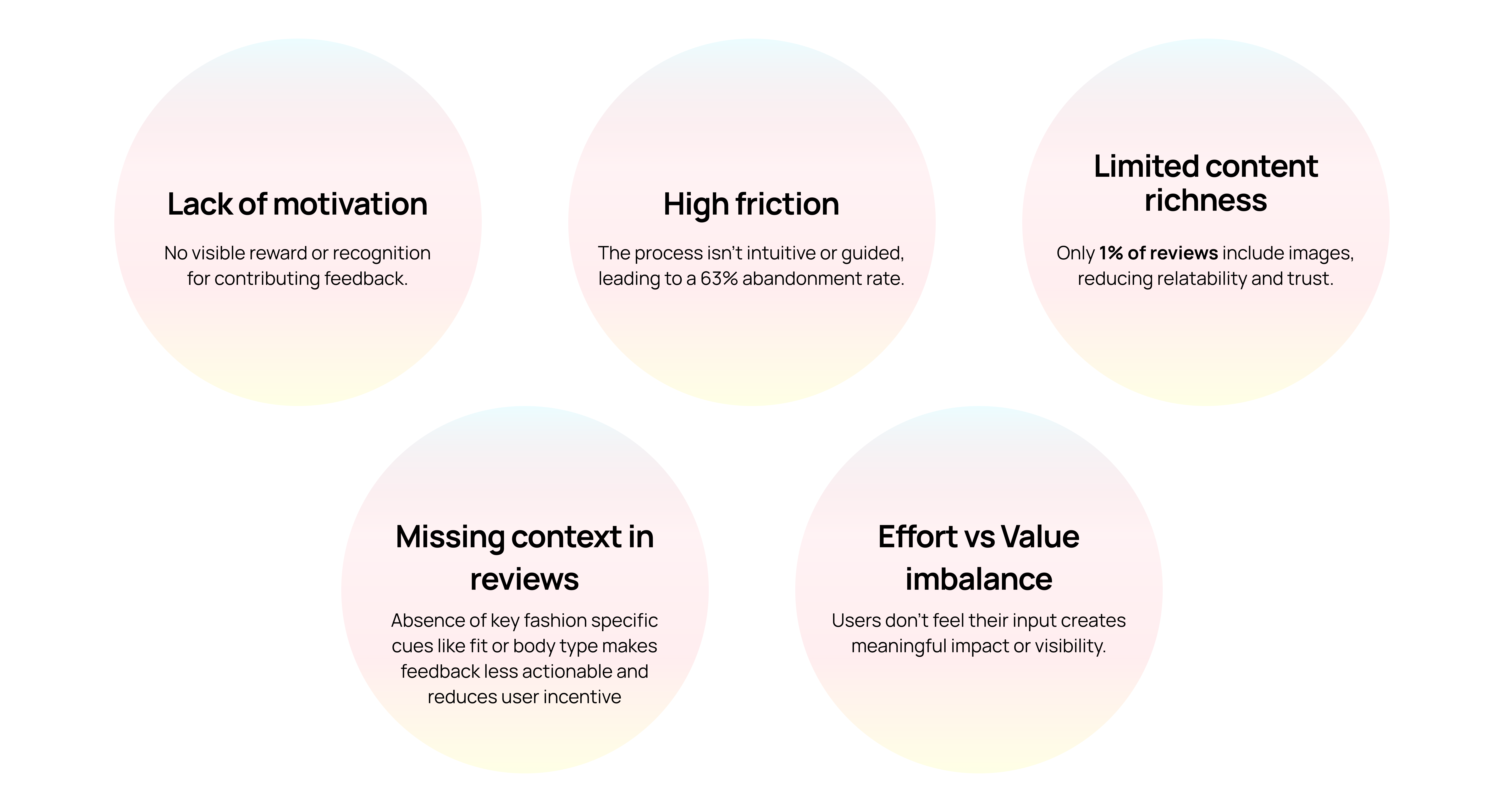
The old flow was long, linear, and lacked delight. Users had to skip each of the 7 questions individually, with no way to submit early. The form felt like a chore, offering no incentive, no personalization, and little motivation to finish


Problem statement
The review experience today feels like a task—too long, not engaging, and unrewarding. We needed to simplify the process, make it more relevant to each user, and turn it into something that felt smooth, meaningful, and worth doing. A well collected review not only helps the reviewer feel heard but also guides future shoppers in making confident purchase decisions.
A closer look at how users interact with the current review system
While the numbers revealed what was going wrong, they couldn’t explain why users weren’t participating. To understand the 'why,' we turned directly to our users.
From interviews to Insights
Real stories, emotional drivers, and insights that shaped our direction.
Research Approach

Key takeaways from research
We combined deep user interviews with a layered analysis of industry best practices and competitor approaches.

From secondary research & competitor analysis:
Incentivizing feedback through visibility and rewards increases user participation, as seen on platforms like Sephora and Google Maps.
Trust is enhanced when platforms offer structured filters, review breakdowns, and credible user profiles.
Attribute-based review formats enable consistent, actionable feedback collection across product types.
From primary research:
Users are willing to give feedback when the experience is quick, purposeful, and low effort
Visual content like photos and videos makes reviews feel more relatable and trustworthy.
Complex or time-consuming flows lead to significant drop-offs in user participation.
Acknowledging users’ input increases their likelihood to engage and contribute again.

— P2, Female, 26, Delhi
Empathy as a driver — users aren’t writing reviews to help the company, but to help other users.
— P6, Female, 31, Bangalore
Emotionally-driven reviewers who only take action when their experiences are extreme
— P4, Female, 29, Mumbai
Authenticity and honesty — users want to balance overly positive reviews with real experiences.
— P4, Female, 29, Mumbai
Users want contextual, relatable feedback- about quality, fit, material, sizing, etc.
The many faces of a reviewer
User Cohorts (Behavioral Segments)
Users interact with reviews in different ways—some are vocal, others stay silent, and a few only speak when something extreme happens. Mapping these cohorts helped shape solutions that meet a range of behaviors and motivations.
These cohorts helped shape personalization strategies and tone adjustments across the review flow. These cohorts would later become design lenses—guiding feature priorities and tone.


Based on everything we heard we paused to define the core problems clearly before jumping into solutions.
Framing the real problem
Reframing the problem statement based on insights
The review flow is tedious and lacks contextual cues, leading to high drop-off and low-quality feedback.
There are two parts to the project.
(Note: The scope of the project is to focus on the review collection part)

Review Collection
With only 37% completion, we saw the need to simplify reviews and drive action through contextual nudges, smart prompts, and meaningful rewards.

Review Showcase in Product
Reviews are vital for trust, but without clear organization and filters, they lose impact.
With the problem clear, we focused on exploring ideas to address user frustrations and motivations.
From concept to creation
To move from insight to action, I led a 90-minute Crazy 8s ideation workshop with peers & stakeholders.
Initial ideas
How to make sharing feedback easier and more motivating
Feedback form
Voice assistance and translation
Monetary rewards for reviews
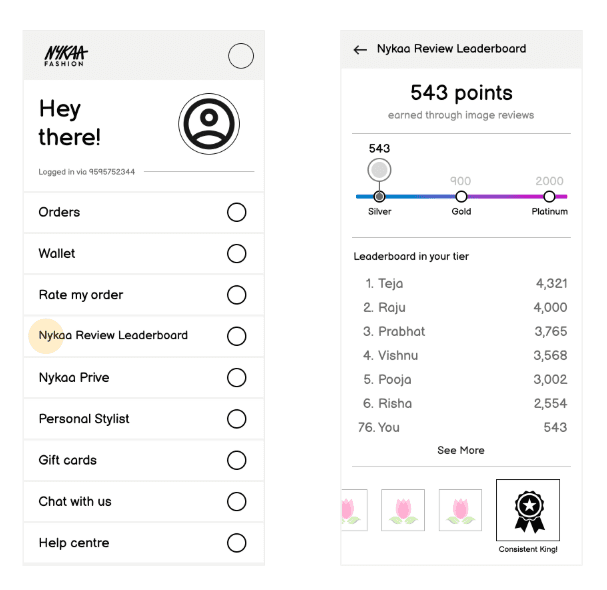
Gamification
Leaderboard & badges
Unique review incentives
User feedback prompts & touchpoints
Inform users of their feedbacks

(Click to expand image)
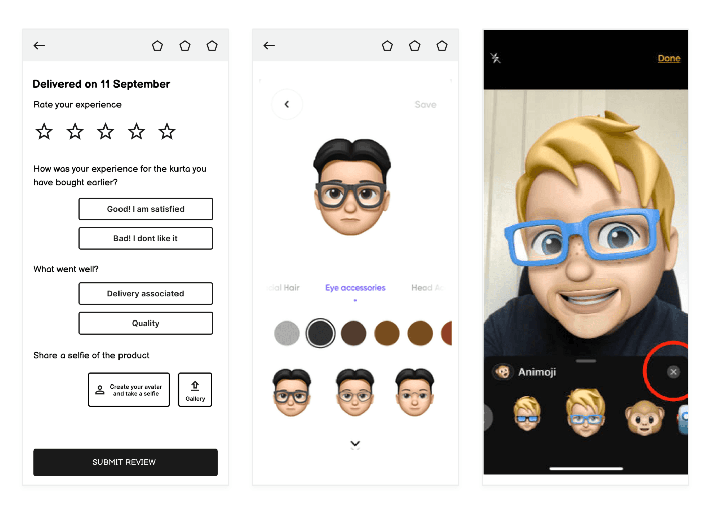
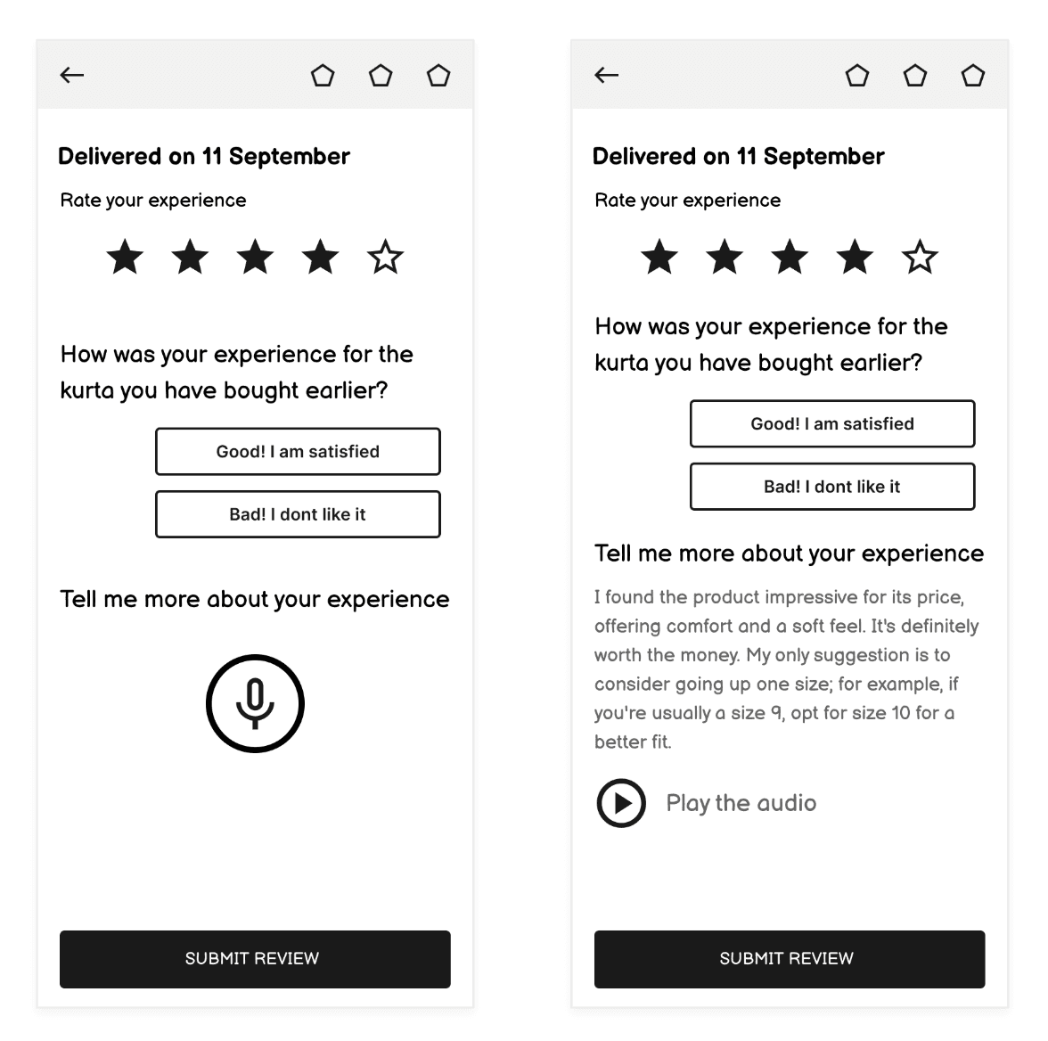
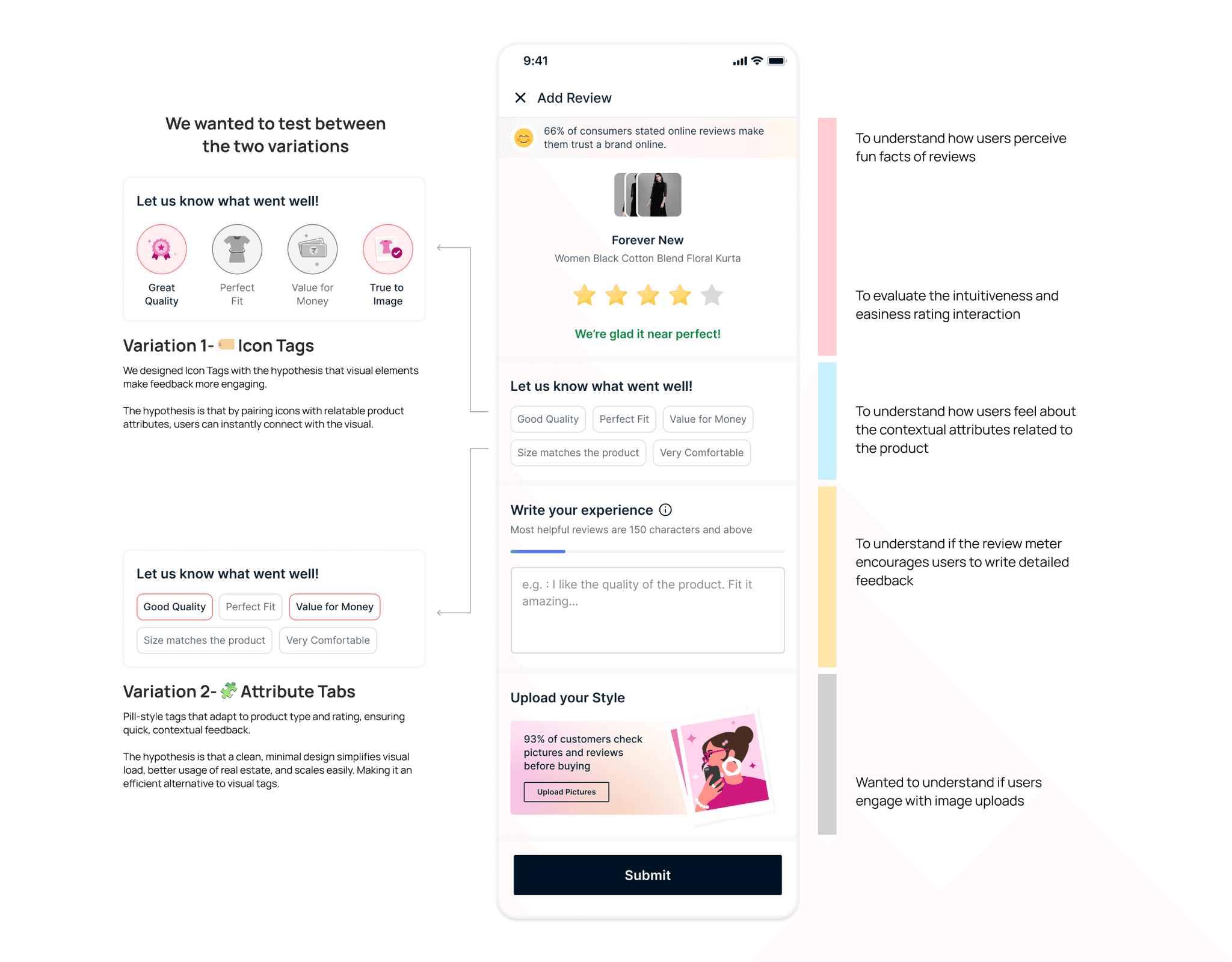
To bring them to life, we translated a few into quick wireframes. Early explorations included concepts like attribute tagging, inline image prompts, and contextual nudges.
Balsamiq wireframs for review collection


Early concepts and testing
Building on the early wireframes, I began translating ideas into functional interfaces and interactions—this time with real-world constraints and dev feasibility in mind.
Many of these design choices directly tackled the key problem areas we had defined—from friction and drop-off, to lack of emotional connection and clarity.
Where users spoke back
Evaluating flow clarity, emotional engagement, and feature intent.
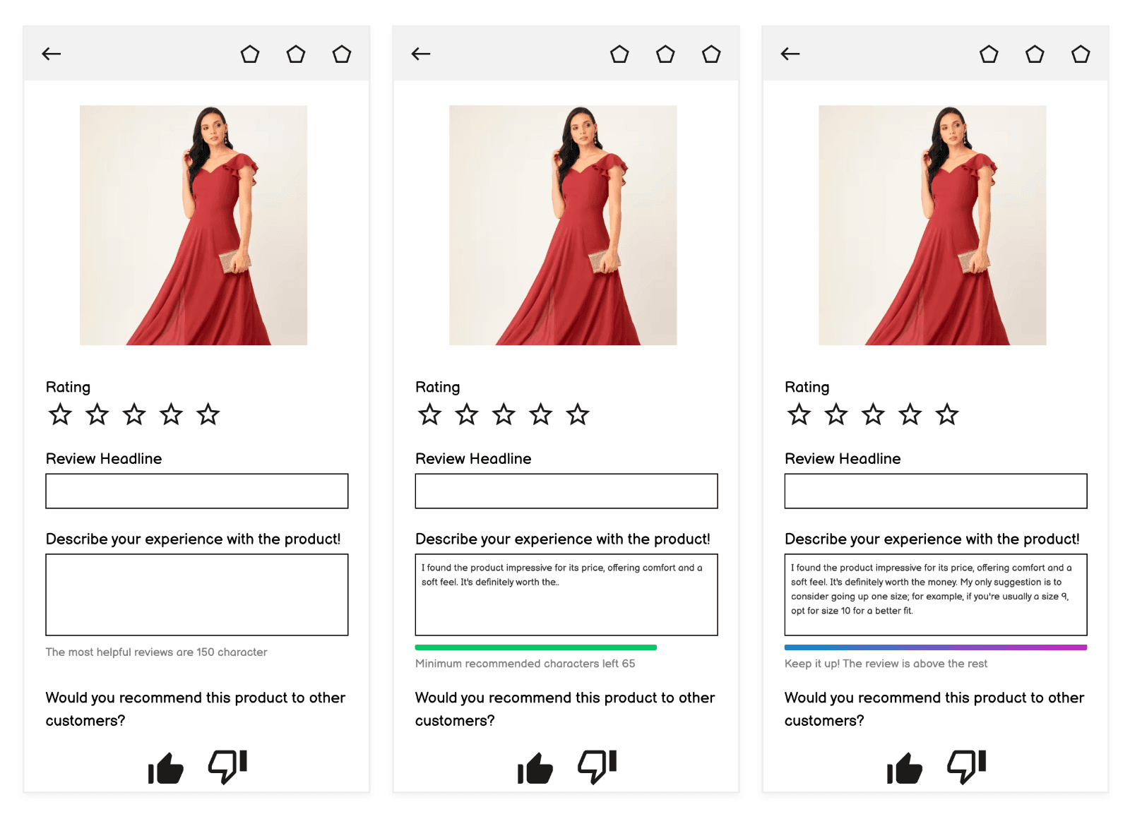
We developed two final variations based on feedback from earlier iterations—refining the review meter, introducing conditional rating and attribute sections, and designing a more relatable image upload experience.
User testing insights

Users appreciated how the form adapted based on their rating—making it feel more intuitive and relevant.
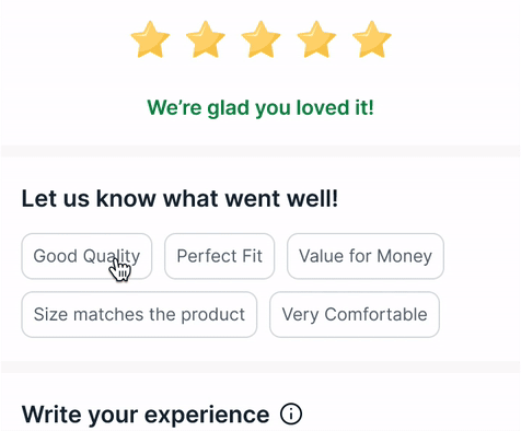
Users preferred the tabbed layout—it was simpler, scannable, and reduced overload.

Users found the fun facts engaging. It added personality to the review process and kept them interested.

Familiar formats drive ease. Star ratings are universally recognized, making feedback quick and intuitive for users.
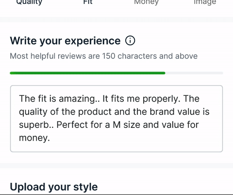
Review meter misunderstood as character limit.

Users expected a reward or acknowledgment after submission.
Where it all came together


Reflection & Impact
What I learned about motivation, emotion, and honest contribution
Looking back, the design wasn’t just about form simplification—it was about understanding people.
Small moments like 'review facts' and microcopy, relatable visuals made measurable impact on engagement.
Emotional drivers like empathy, honesty, and self-expression were more valuable than incentives alone.
Creating space for user voice meant removing friction and highlighting value at every step.
The foundation is set. The next step: Review Showcase—a phase dedicated to making every voice not just heard, but seen.
Early results from launch show encouraging signs of growth in review engagement and quality
(As of 15 April 2025)
